|
|||||||||||||||||||||||||||||
|
Main / NEW / 2007 02.02.2007. Mineral water “Znamenovskaya” of TM “Biola”. Design of 5 liter bottle.
Mineral water “Znamenovskaya” is one of the oldest products with stable sales in the assortment of CJSC “Erlan”. But despite of this there existed a range of problems related to the package and design of the product as a whole. 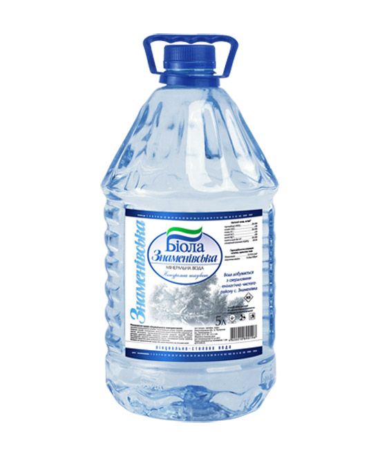
Problem – bottle design and location of reinforcement ribs did not allow storing finished goods in more than two tiers; – Label made of self adhesive sticker looks not very tidy and modern. Actions – design of bottle was improved considering the wishes of technological and logistic departments; – new label design was created. Bottle design. Crucial motive for a new design of “Znamenovskaya” is the wave. Waves insisted on their presence on the label and on the bottle. Except for their decorative role they also performed a role of additional reinforcement ribs since in old design it was exactly that part of the bottle which suffered the most when stored or transported. 
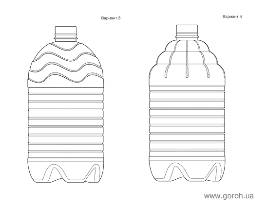


Lable design. Except for 5 liter bottles “Znamenovskaya” mineral water is produced also in 0,5 liter, 1,25 liter and 2 liter bottles. The labels for them are printed on a transparent film. Therefore for 5 liter water a round semitransparent film was used. In order to economize material the height of the label should be minimum permissible for automatic labeler. Wavy background of the label designed for 5 liter bottle was an interpretation of smaller “Znamenovskaya” labels designed by another agency. If you can strain your imagination very hard you can take those broken lines as very stylized waves. Besides they look like ice hummocks of Arctic Ocean. 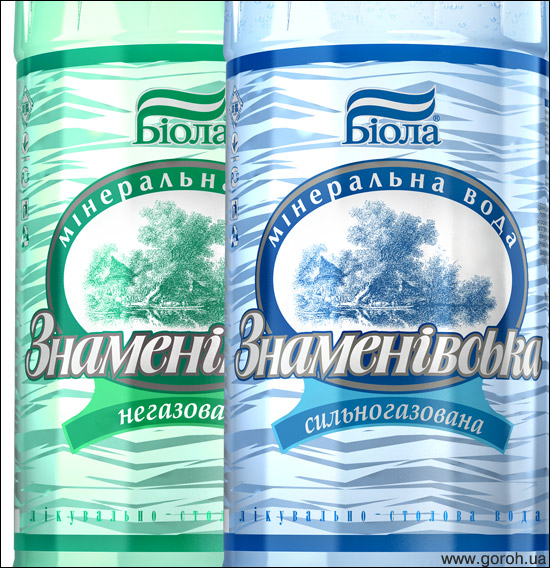

Sinusoids of all kinds which were used in other variants of design and preceded this one died and were consigned to oblivion. 


The result of our work – neat and laconic product design. Customer: “Erlan”, Dneprpetrovsk, Ukraine. www.biola.ua Design and printing preparation: Gleb Gural’nik, Goroh agency. Printing: “Ukrplastic”, Kiev, Ukraine. www.ukrplastic.com 2007
|
2007
|
||||||||||||||||||||||||||||
|
|||||||||||||||||||||||||||||
