|
|||||||||||||||||||||||||||||
|
Main / NEW / 2010 03.11.2010. Design of label for “Emmi” jam
When I was little my grandma used to seal jam in glass jars, at that doing this each summer in some giant quantities. She glued hand written labels on the lids – “strawberry”, “raspberry”, etc., and the date of “release”. The whole closet was filled with those jars. It looked like each time she made a reserve for the case of war.
It was like this indeed – my grandma overlived the war, and she knows very well what “there’s nothing to eat” literally means. Store is no sore… …When we received an order for the label for a “jar of jam” I immediately recollected those cases when I went stealthily with an electric torch to the closet. There in the closet heaps of various odds and ends were stored and the lamp under the ceiling was inaccessible. So I used my electric torch to direct its light to the jars and read what is written on their labels. Grandma’s handwriting was quite specific and sometimes I could not understand it. Then I felt pity that there is no decal on the jar (remember decals? Usually they were sticked on a fridge because of its smooth surface) showing what ‘s inside. I am sure I would never confuse the pictures of strawberry or raspberry. Well, this is it… Customer’s wishes were simple: good-natured, a bit age-old design, “grandma’s jam”. 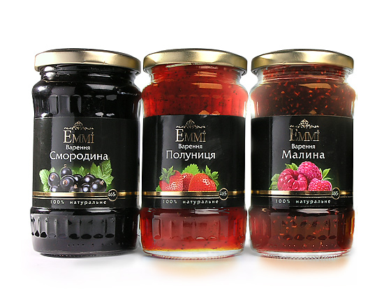
Jam from ТМ “EMMI”. “Currant”,”Strawberry”, “Raspberry”... The first thing that comes to any designer’s mind – to draw a grandmother with the jar of jam in hands and with a small house on the background. And of course with chickens and cows nearby. Plus trees: like cherry, apple… Otherwise you will not feel it’s a real village and of course the jam will not seem to be “grandma’s“. As a rule good designers cut off the first idea which comes to their minds and tend to “chop off every superfluous thing” in packaging design since the shopper spends only 12 seconds for studying the packaging. If during those 12 seconds he doesn’t decide in favor of s certain jam (or some other merchandise) then he will more than likely not take it. Grandmother, horse with cow, and bees in the blue sky decorated with rainbow – customer in the supermarket has no time to grasp this entire “hodgepodge”. That is, let’s place it in a bit different way… The customer has got time but such “hodgepodge” puts pressure on his/her psychics with its pop nature from one side, and number of details – from other side. And even having no notion about the processes which are taking place in his/her head the customer will just pay no attention to such package. But we want him to pay... attention. 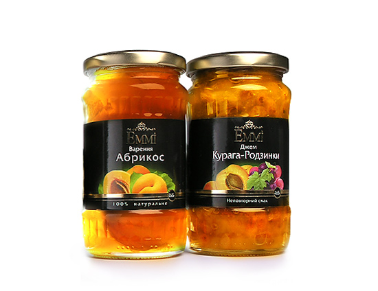
...”Apricot” and “ Dried apricots with raisins”. Oh… Yummy! Black color (which “creates negative picture”, aha…) gives nobleness. Even with some age-old refinement in combination with “gilded” letters “EMMI”. The picture shows the content of the jar. No need to think. Confirmed with letters (one word!). Font, matter of course, was chosen purposely. Oh, how I wish there had been such jars 30 years ago… Total effect – simple, understandable, 3-4 seconds for clear and rational understanding on the content and all remaining time – for emotional perception of colors and letters combination. Sure enough the sense of some age-old refinement comes to you immediately, even before you start reading the text. Customer was satisfied with our work: jam despite of all “taboos” sells well. We hope that our design plays not the least role in this. 2010
|
2010
|
||||||||||||||||||||||||||||
|
|||||||||||||||||||||||||||||
