|
|||||||||||||||||||||||||||||
|
Main / NEW / 2010 19.10.2010. Package redesign for TM “Baron-Makaron”
Minimal profitable order of a flexible package (film) is one ton. For such small enterprise
as collective farm enterprise «Bushtruk» (CFE «Bushtruk») which produces pasta and has «slow» product turnover this means not to change package design from half a year till a year. Until old package runs out, it won’t be possible to order a new one. CFE «Bushtruk» owns «Kiev Miks» which is rather famous trade mark. Pasta of lower price is produced under that trade mark. Selling goes well under that trade mark. However, the thought that only soft wheat pasta of low price is sold well gives no peace to the owner of the enterprise — the person who knows a lot about his business. Manufacturing of hard wheat pasta, usual for Italian people, will make it possible to earn profit and of course enjoy the process. Original design of TM «Baron Makaron» is quite creative. It is rather uncommon to use the image of young baron. The only problem is that baron looks like Plohish from «Tales of Boy Malchish Kibalchish» by Arkadiy Gaydar. The boy turned out to be very self-complacent. 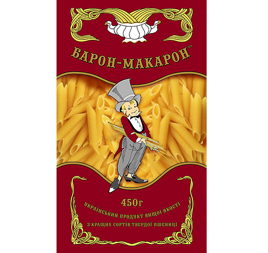
Due to low sale of the new trade mark, the customer applied to our agency. While designing a new package we took into account right positioning of the product, target audience, brand structure and other “stuff”. The new hero is a horse which is ridden by a knight with a cocktail straw atilt. The most failed decision for brands is yellow background that didn’t contrast with the product which can be seen through the package. 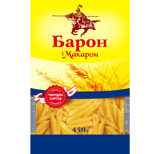
When the customer applied to our agency, he had an idea to stimulate sales using previous design of the product. We slightly helped him with this and developed an advertising hybrid of knights and pasta . We don’t sale pasta. We sale design. That’s why the following package design of TM “Baron Makaron” is a result of customer’s creative thinking. The best solutions made in old package design and ideas taken form competitors’ packages became parts for a new design. Thus, green background was borrowed from the leader’s package in the market segment of pasta. General arrangement was taken from original design. The hero was drawn again Yura Zhuravel , art director of Goroh agency:
" The previous boy looks like real baron, the owner of pasta factory. All baron’s attributes — top hat, bow tie, tailcoat fit him tightly. I think that the hero pictured on the package should act as if he is “Baron Makaron”. The boy should wear somebody’s top hat, bow tie and, for example, shoes. Top hat covers his eyes, he has to drag his feet in order not to jump off his big shoes. All these things cheer him very much. 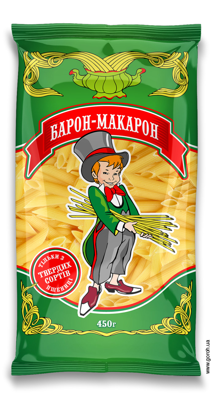
New package design of TM “Baron Makaron” was printed twice by the customer. When it was printed for the first time, the fact that colors of a printing become pale on a transparent material wasn’t taken into account. But this is another story.
Customer: Design and illustrations:Yura Zhuravel, Goroh agency. Prepress: Sasha Fediy, Goroh agency. Printing: typography «Marzek Pechatny Dvor», Dnepropetrovsk, Ukraine. www.marzek-pd.com The price for pasta package redesign of TM ”Baron Makaron“. Design concept — $1000. Making of illustrations — $750. Prepress — $300. Total price for package redesign: — $2050. Start of the project — 18.08.2010. End of the project — 19.10.2010. Total time for project accomplishment — 2 months Out of topic: iron design of the exhibition stand of Out of topic again: the way we painted Lexus The rest of package design examples. 2010
|
2010
|
||||||||||||||||||||||||||||
|
|||||||||||||||||||||||||||||
