|
|||||||||||||||||||||||||||||
|
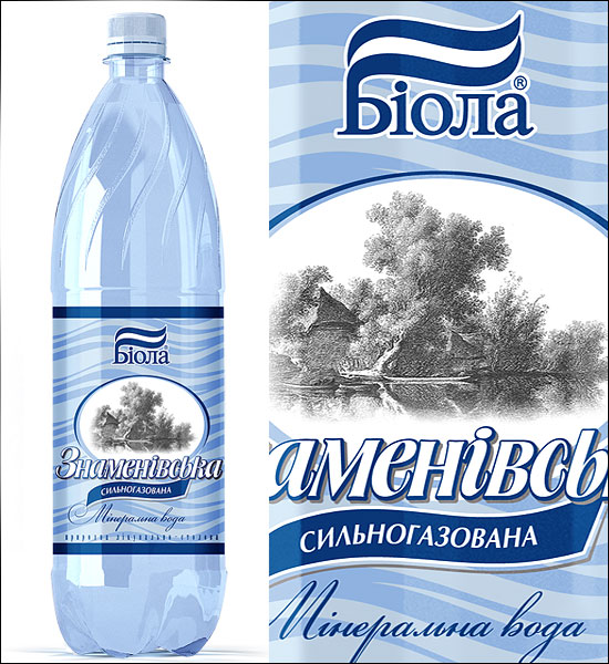
Main / NEW / 2011 01.04.2011. New design of “Znamenovskaya”.
Mineral water “Znamenovskaya” has been produced since 1997. It is the first product which CJSC “Erlan” started producing under “Biola” trade mark. Design of this product has been changing more than once within its history. General trend: from complexity to simplicity.
2002 год.
Image was kindly provided by CJSC “Erlan” Paper label. Logo of TM “Biola” is with blue and green wave. Practically the entire label area presents the engraving of rural scenery. The village looks like Ukrainian but in fact it was drawn following the traditions of someone from “the Flemish school of painting” where naturally Dutch village was pictured. 2004 год.
Image was kindly provided by CJSC “Erlan” Label is still made of paper. Flemish and Ukrainian scenery is smaller and framed in oval. Logo was decided to be one-color. On the label for carbonated water the logo is a dark blue one, and on non-carbonated – green one since the prevailing color in this label design is sea-green. On the background of both labels: for carbonated and for non-carbonated water there are zigzags of correspondent color. These were added apparently for avoiding some sort of emptiness. 2006 год
Nothing changed. Just the material for label became a transparent film. Lighter parts of background are those which were left transparent in order to emphasize the cleanness of water. 
2009 год
This label; design of “Znamenovskaya” in 2009 was made by our agency. All design elements became more “airy”, and zigzags were replaced by perfectly logical “waves”. 
2002–2011. Progress reached within 9 years
Mineral water “Znamenovskaya. Label design. Years 2001-2011. In 2011 the decision was made to change the bottle. Now “Znamenovskaya” water is bottled in “fashionable” bottles in which starting from 2009 popular drinks of trade mark “Biola” have been sold. «Icy Cola» и «Quake». Due to the narrow label the rural scenery became “uncalled”. 
Sign. «Aqua Balance»
The place was cleared from everything “unnecessary” and the sign “Aqua Balance” was put. “Aqua Balance” is the basis of advertising campaign of “Znamenovskaya”. This sign symbolizes a balanced combination of salts and minerals. The image of “Girl on a Ball” by Pablo Picasso known to everyone was converted to a figure balancing on a drop of water. On the basis of materials from photo session provided by “Praktika Production” and received in the result of shooting of advertising clip the designers of Goroh agency prepared a nice poster. “Znamenovskaya”. “Ideally balanced by nature”
Customer: “Erlan”, Dnepropetrovsk, Ukraine. Biola.ua Label design: Lyosha Subbota, Sanya Fediy, Goroh agency Prepress: Sasha Fediy, Goroh agency Poser design: Serge, Bezugly, Goroh agency Printing: printing house “Blitz-Flex”, Kiev, blitz-flex.com Design cost. Label — $730 Size adaptation — $500 3D (6 positions) — $375 Poster design — $1100 Project start — 07.12.2010 Project finish — 01.04.2011 Total duration of works — about 4 months On topic: brand book for TM «Biola» Off topic: design development for beer of TM «Kil’chen» Other examples of label designs for different drinks 2011
|
2011
|
||||||||||||||||||||||||||||
|
|||||||||||||||||||||||||||||